How to approach your website data and improve your users’ experiences & conversions
Interpreting website data into actions that get results isn’t always a straightforward process. But we at Extellio have developed a way of thinking about websites that can help you draw meaningful and actionable conclusions that contain some real potential for improving overall user experience and conversion.
You’ve probably spent some time staring at your website’s analytics trying to figure out what people are doing on your site and why. You may have asked yourself: “Why does their behavior seem so erratic?” Or “Why don’t they just convert?”
It’s not easy to translate whatever conclusions you draw from analytics into actions or development plans. That’s partly because website analytics only allow you to see some of the picture, leaving you to fill in the blanks with guesswork. But it’s also because we tend to think about our data from one perspective at a time.
To go beyond that guessing game, we use a simple methodology that relates the available data to 3 key aspects of a website:
1. What visitors want to do
Visitors come to your website for a reason, they have something they want to do on your website - their intent. It might be just browsing around, but for most of them, it’s much more specific. They might want to find a particular piece of information, understand more about a product, use an online service, or read blog content.
2. What you want visitors to do
As a website owner, on the other hand, you have things you want visitors to do on your website. These are tied to your website goals and in the larger picture, your company goals. You want visitors to buy something, leave their email addresses, find product information, use self-service tools, and whatnot.
3. What visitors actually do
How visitors act on your website is a different question. They usually try to fulfill their intent, but they can take indirect routes to get there. Even if they don’t get side-tracked, visitors tend to be a bit all over the place. Smooth and direct user journeys are very rare. We’ve all experienced a “bad website”, and spent too much time looking for something we couldn’t find or trying to do something that didn’t work.
Looking at things this way will put your data in a more holistic perspective and help you realize what information you lack in order to draw meaningful conclusions. It’s a slightly more advanced approach than the average “do’s and don’ts” list, but also more powerful. It’s a simple technique to organize your thoughts and start making measurable progress.
Aspects that don’t perfectly match-up?
We’ve now covered the three essential (yet, different) aspects of a website. So far, so good. But why do they matter? The point here is that the intent, actions, and goals almost never perfectly match up. Accepting that truth will make it much easier to understand what's happening on your website and why.
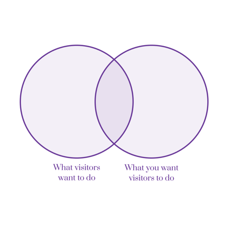
When you think about it, it’s obvious that visitor intent doesn't always correspond with your website goals. Your visitors will want to do things that don’t always fit with your aims, and you will want them to do things that they haven’t planned on doing. We can illustrate this with the overlapping circles of a simple Venn diagram.
What about the things your visitors actually do on your website?
Of course, you won’t be able to get visitors to always do what you want. If that were the case, you’d have a 100% conversion rate and hefty job offers from every e-commerce and SaaS company online.
Businesses may be focused on driving conversions or generating leads, while visitors may want to browse and research products without feeling pressured to buy.
It is important to strike a balance between your business objectives and the needs and wants of your visitors. This requires careful consideration of user experience design, content strategy, and marketing tactics that will encourage visitors to engage with your brand while also providing value and solving their problems.
When visitors intent doesn't match up
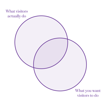
There’s even a mismatch between visitor intent and behavior. Visitors may come to a website with a specific intent or goal in mind, but if their actions are not met with relevant content or a user-friendly interface, they become frustrated or annoyed. Remember all those times you tried to find or do something online and ended up cursing about bad websites?
It can also happen when the website provides too many options or when the layout is cluttered and overwhelming. Visitors may end up spending time scrolling through irrelevant content or exploring other parts of the site that do not align with their original intent.
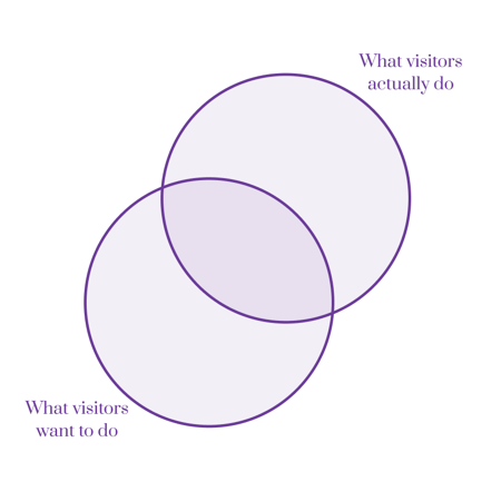
But it's not just bad - sometimes users are just curious! That's why you'll see potential customers scroll through job applications or read through your annual report, or financial analysts looking through your product catalog.
All together
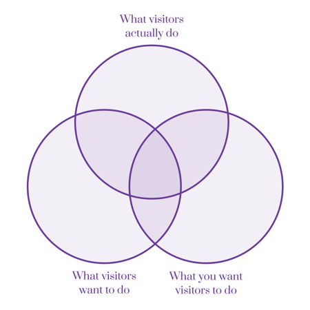
You can see where this is going. Let’s put it all together into one simple diagram for understanding your website and the different forces at play.
It’s a very basic but quite powerful way to think about your website. The diagram is like a map that visualizes the dynamic between visitors’ actions, their intent, and your goals. And it can show you the way to improve things!
Your aim is to increase the overlap in the middle, your sweet spot. But first, let’s just look a bit more closely at what the different areas of our map represent, starting in the middle and working our way out.
Navigating the diagram
1. This is the sweet spot, the good conversions. This is where visitors want to convert to your goals and manage to do it without too much hassle.
2. This is your potential. Here, you share a common goal with your visitors, but they don’t manage to fulfill it on your website.
3. These are the things that don’t drive your business forward, but you let users do on your website anyway.
4. These are the bad conversions. When you manage to get users to do something you want them to, but they don’t. These are things like well-hidden pre-checked boxes about newsletters that visitors don’t always notice. People can usually only be fooled once by something like that, and the distrust it creates will very likely exceed any momentary gains.
5. These are your unrealistic goals. You’ll either want to reconsider them or somehow make them appealing to your visitors.
6. These are visitors’ unmet assumptions about what one should be able to do on your website. You can either embrace them and make them part of your own goals or inform visitors that your website won’t do them.
7. This is your dead weight, the areas on your website that are neither relevant for your business nor your visitors.
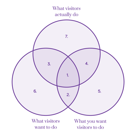
Now that we've gone through all the parts of our diagram, how do you apply it to your website? How do you know what’s dead weight, what is potential, and what is in the sweet spot? Well, you can listen to what your gut has to say. You might get lucky, but it can just as likely be wrong. A safer way is to let real data guide your actions.
Apply it on your own website
It’s easier and makes more sense to map out a separate diagram for each of your target groups, e.g., existing customers, potential customers, suppliers, job seekers, employees, etc. Start with the three or four of the most important groups.
The one thing you can control is your own goals. Make sure you have thoroughly thought them out for each target group.
You can measure user behavior (what your visitors actually do) with web analytics, heatmaps, and session recordings. You can measure visitor intent (what your visitors want to do) with surveys. These are good for segmenting your data into relevant user groups as well.
In our experience, the most powerful diagram is when you've collected data from multiple sources: surveys, analytics, heatmaps and session recordings. To be able to create a diagram that leads to worthwhile insights, you need to be able to segment your behavioral data based on your survey data and the other way around.
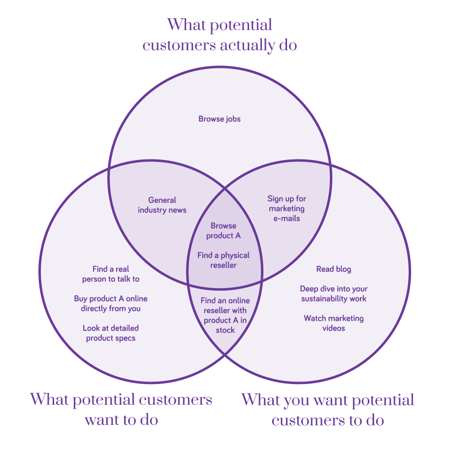
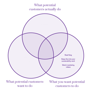
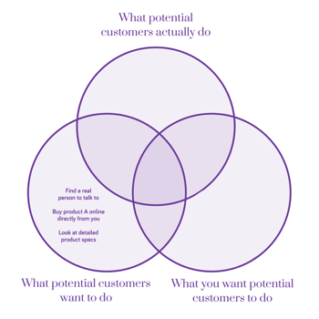
An example for the target group of potential customers might look like this:
Investigate your potential
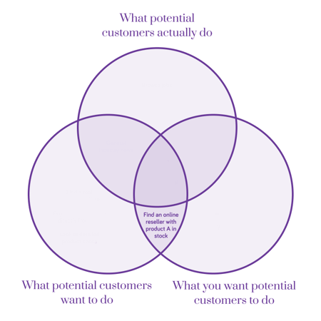
The next step is to investigate your potential - what visitors want to do and what you want your visitors to do, but that visitors actually don't do.
In our example, there’s only one objective listed as potential: “Find an online reseller with product A in stock.” But in real life, there will be several things, especially when you start mapping more target groups.
Investigating your improvement areas is detective work. Taking our example for a start we’d begin analyzing everything we know about the subset of potential customers that want to find an online reseller.
First, you have to try to isolate the problem. Does it apply to all potential customers or only to some of them, like visitors from specific counties?
Once the problem is isolated, you can investigate why it occurs. At this level of the analysis, you need to get granular and look at every piece of data you have. The combination of surveys, feedback, heatmaps, and screen recordings should give you more than enough to come up with a couple of well-founded hypotheses.
Did visitors succeed in finding the online resellers page? If not, where did they take a wrong turn? If they found the right page, why did they fail? Is it that resellers don’t have the product in stock? What can screen recordings tell us about the functionality of the page? Have users commented on their problems in surveys and feedback?
When you’re done, you summarize all your findings into testable hypotheses. You’ll find that they are much fewer and much stronger than you’d ever get them by using the traditional analytics-only approach.
Now, you need to apply the changes you believe will make a difference to your website. You can track your changes using a KPI that applies to your problem, generally a user success score or a conversion rate.
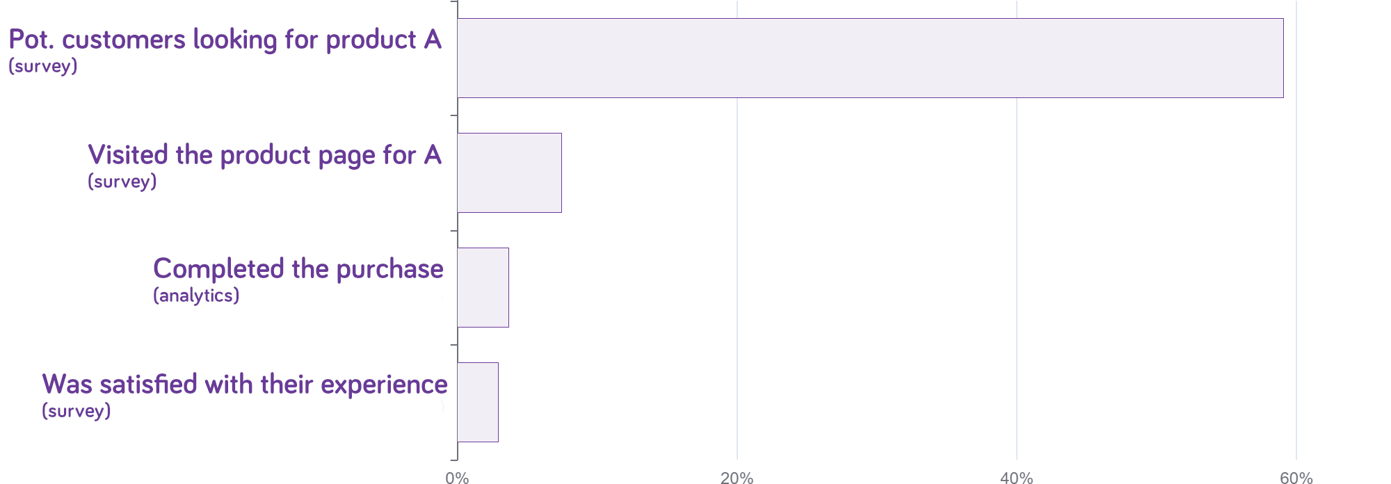
If you want to track progress more closely, you can set up a multidimensional funnel, which is a funnel combining both analytics and survey data.
Funnel for potential customers looking for Product A
Reconsider your goals and services
We are not quite done yet. There are more areas on the map that deserve our attention. The things you want users to do but that don't interest visitors, for example.
First, you should consider if you want to have those objectives as goals and if they're actually important for your business. If they are important, you need to put more effort into building interest in those objectives.
Identifying the perceived value of the activity or task and communicating it effectively to your visitors goes a long way in generating enthusiasm.
Be nice to your visitors
It’s also worthwhile to take a minute and think of things visitors would like to do, but you don’t really care for and maybe don’t even have on your website. There are bound to be some things there that could improve the user experience if you offered them.
Visitors generally get frustrated when they can't find what they're looking for, no matter if it's supposed to be on the website or not. That frustration can spill over to the image of your brand and shouldn't be underestimated.
You can't make everyone happy, but if you can identify common things potential customers want to do that you don't offer, you should consider implementing it. It could even serve as one of your own goals, or at least as something that could get your visitors closer to one of your conversion points.
Final words
This method came about from Extellio’s need for a systemized way to lead discussions with clients around their different kinds of UX data.
We discovered that it’s a great tool for organizing team workshops to generate, discuss and prioritize hypotheses for updating websites. It’s also a simple way to communicate with the rest of the organization regarding priorities and resource allocation.
This method is not a universal solution to all website problems and not the only approach or advice you should consider or apply. You’ll still benefit from the dos and don’ts, UX writing rules, CTA guides, and so on. Our point is that it’s not always about the details (although they do matter). Sometimes, it pays off to look at the big picture and work your way down.
Author: Jonas Velander

